UI/UX Designer
·
January 2024 – August 2024

Managing shared expenses often creates confusion and tension. FairShare simplifies bill splitting and group expense tracking to make balances clear.
Originally developed as an interdisciplinary BCIT project, FairShare evolved into a focused MVP centered on shared expense workflows.
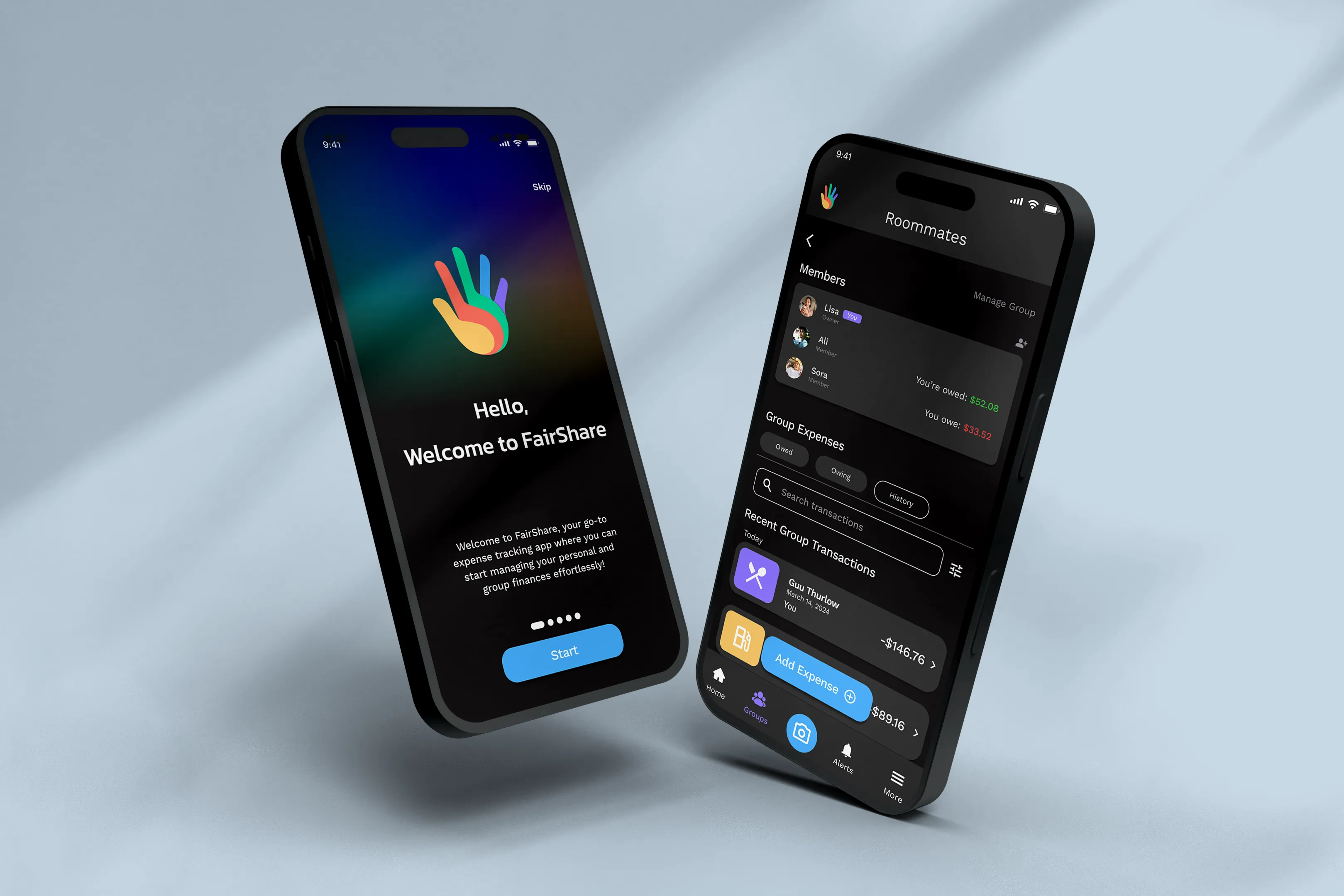
As a UI/UX and Product Designer, I translated research into a flexible shared-expense system that reflects real-world group dynamics.
One roommate covers utilities, another fronts rent, everyone chips in for groceries but not always evenly, not always on time. By the end of the month, nobody's quite sure who owes what or how far back the debt goes.
How might we design a shared-expense experience that keeps a running group balance clear, without anyone having to chase it down?

We surveyed young adults, primarily students, to understand how they currently manage shared expenses.
Over 60% were frustrated with manual tracking, 50% struggled specifically with splitting group bills accurately, and more than 70% wanted flexible tools that adapted to their habits.
As scope narrowed to shared expenses, the primary design target became users like Sofia, young adults splitting recurring costs with people they live with, frustrated by delayed reimbursements and manual tracking.
Shared expenses are currently managed through a mix of dedicated apps and informal workarounds. The comparison below highlights how each approach structures balances, splits, and interaction models.
Synthesizing findings from user research and competitive review revealed several consistent patterns:
Manual input leads to inconsistent tracking and drop-off.
Uneven payments and reimbursements lack flexible support.
Unclear permissions and data usage reduce adoption of advanced features.
Complex navigation increases initial cognitive load.
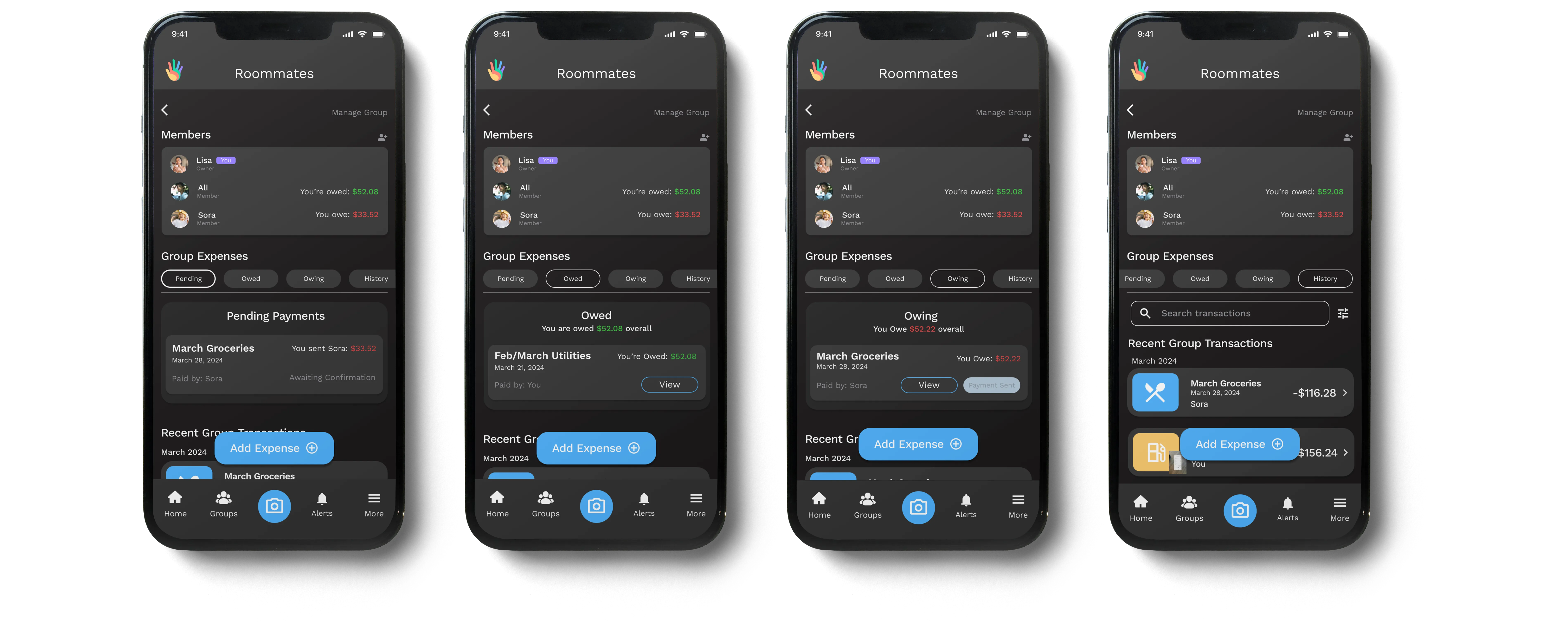
FairShare reflects how group finances work in practice, rather than forcing users into rigid systems.
The solution focuses on:
Supports uneven payments and shared bills to reflect real-world scenarios.
Streamlined entry and clear sequencing reduce coordination effort.
Shows who paid, who owes what, and how balances evolve over time.
Uses secure bank integration while maintaining clear data transparency.
We mapped out how users manage both personal finances and shared expenses: tracking spending, splitting bills, and settling debts over time.
This gave us a clearer picture of the full journey and helped us identify where shared-expense flows needed the most attention before we started designing
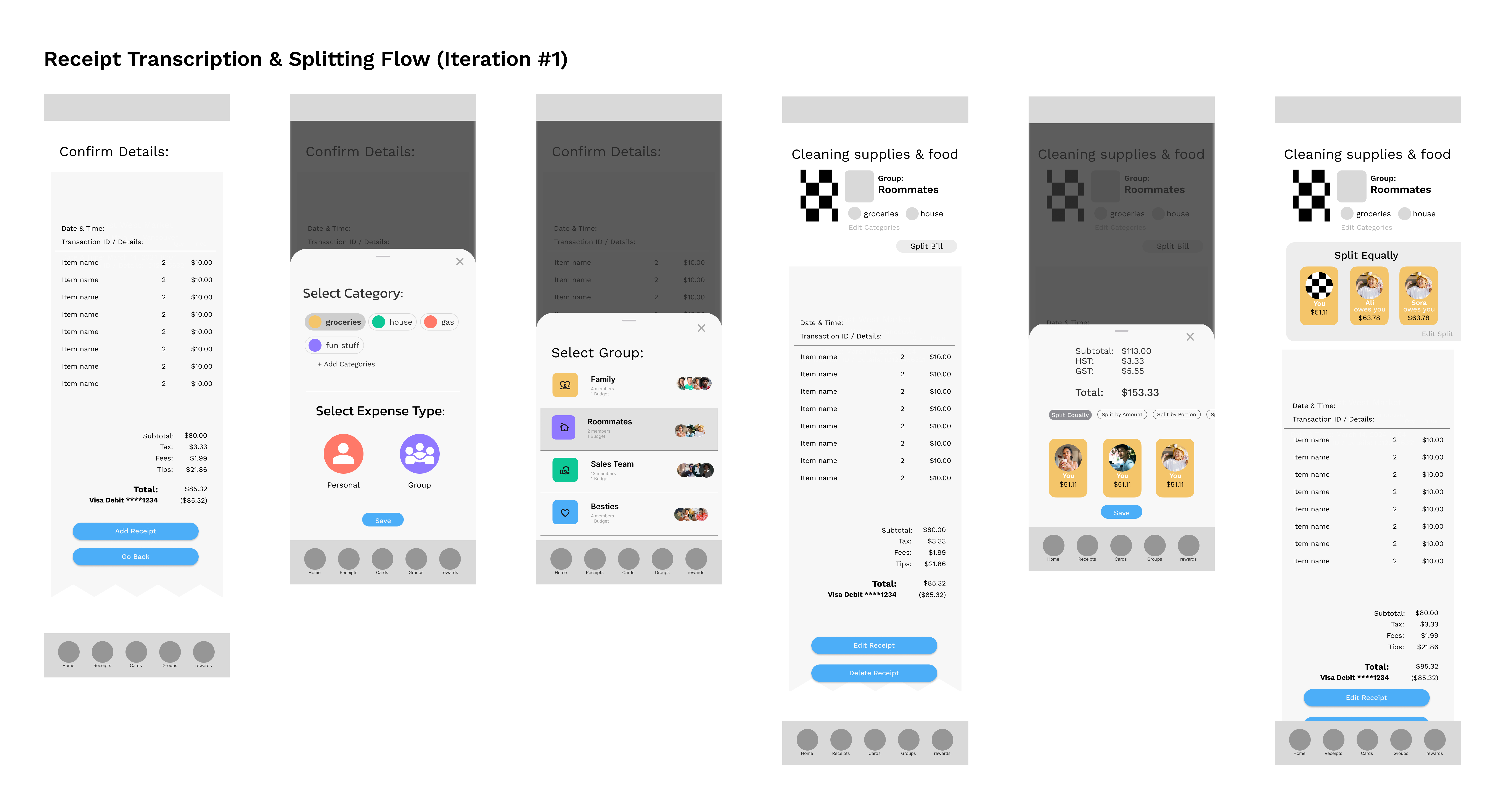
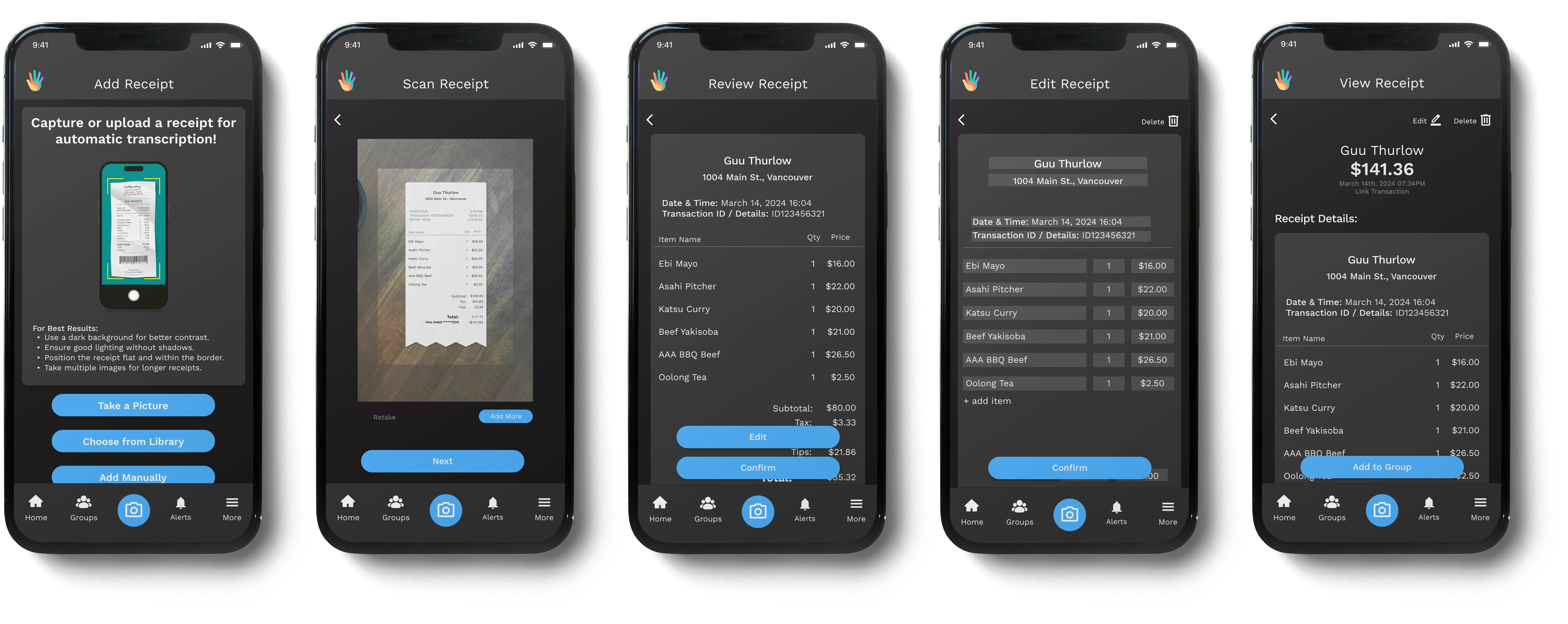
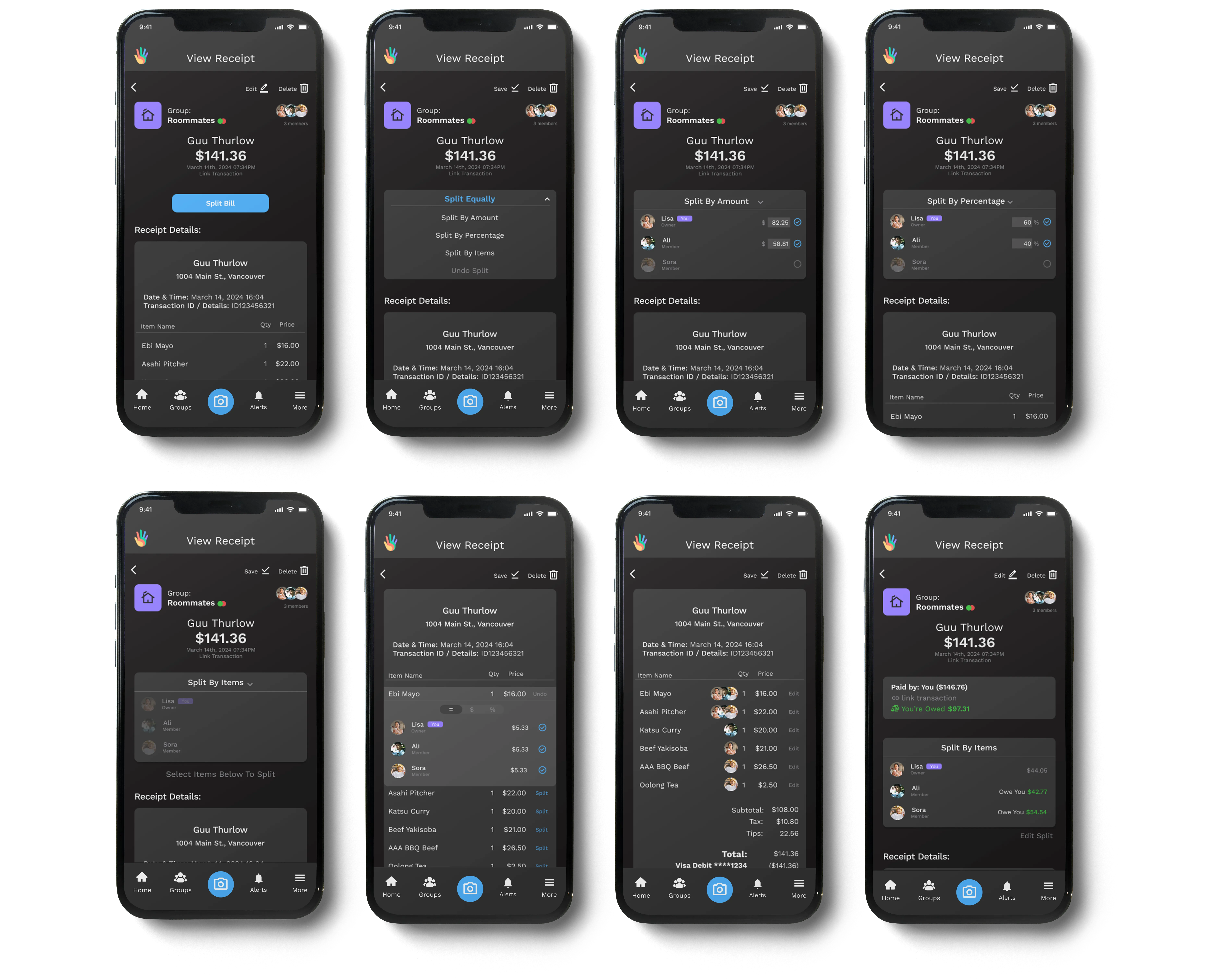
The first iteration stacked too many decisions upfront before users had even confirmed the receipt.
We ran task-based testing with 5 participants across three flows to find out where it was breaking down.
Findings:
The main issue was cognitive load early in the flow.
Iteration 2 sequenced decisions differently: receipt confirmation first, group assignment second, splitting last.
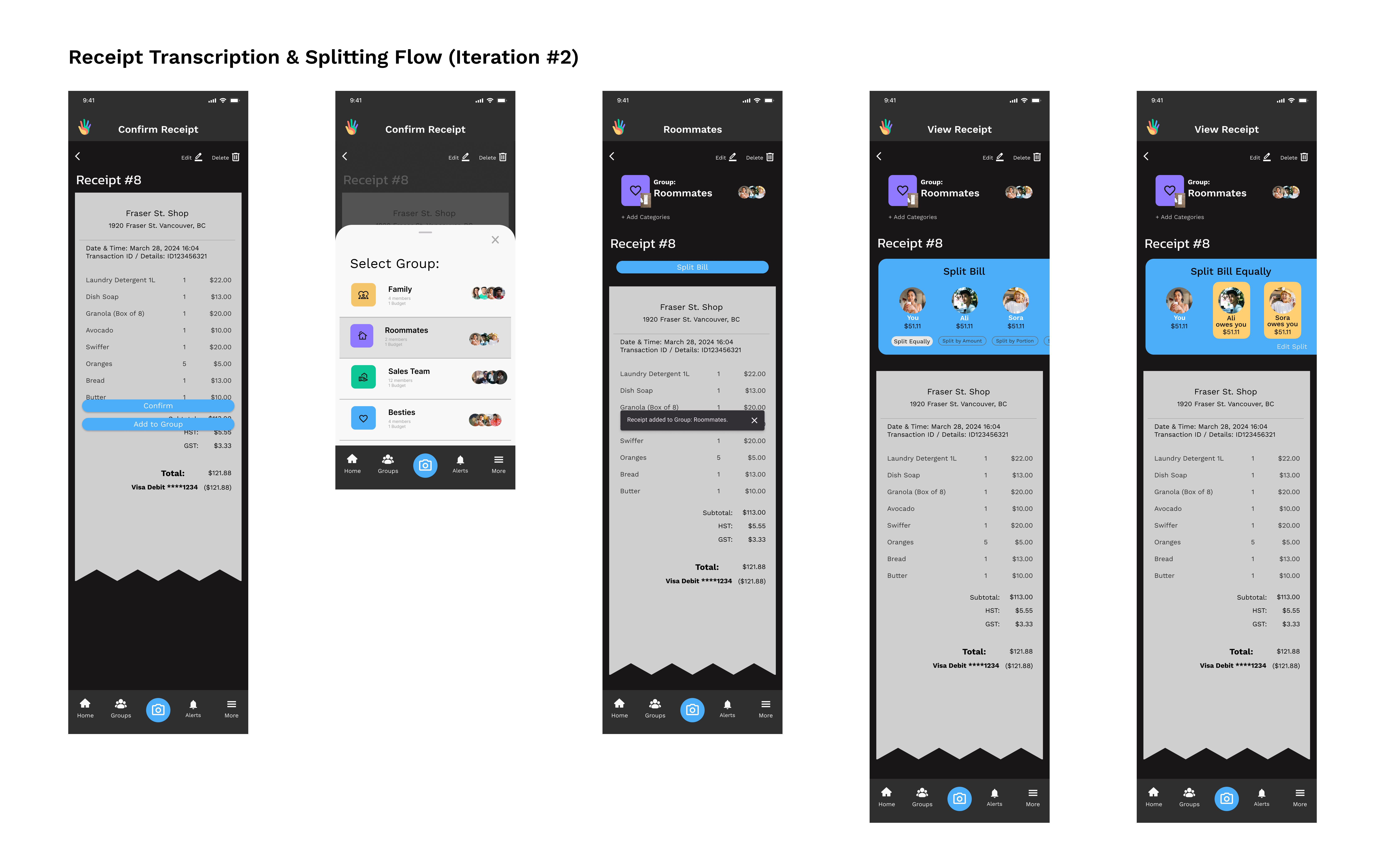
One decision at a time, in the order that feels natural.
Group details surface only when they're actually relevant.
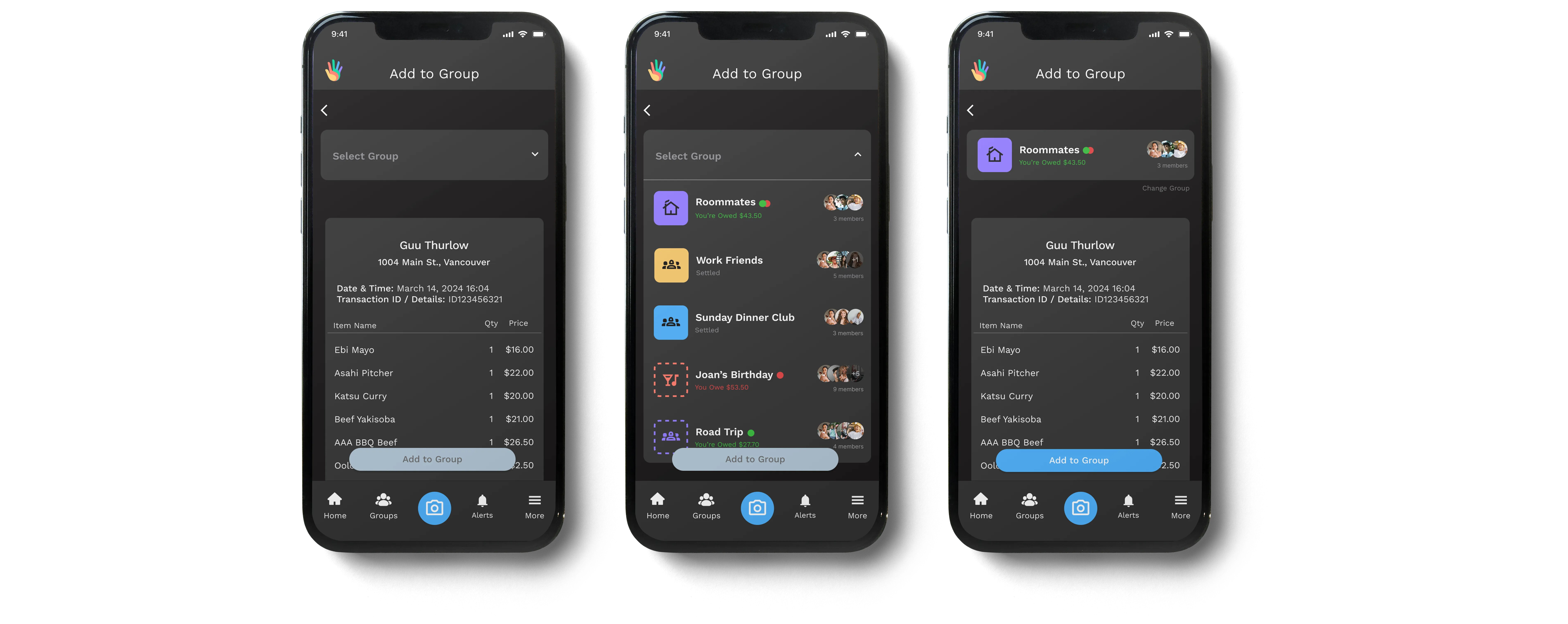
Receipt details stay visible throughout the entire splitting process.
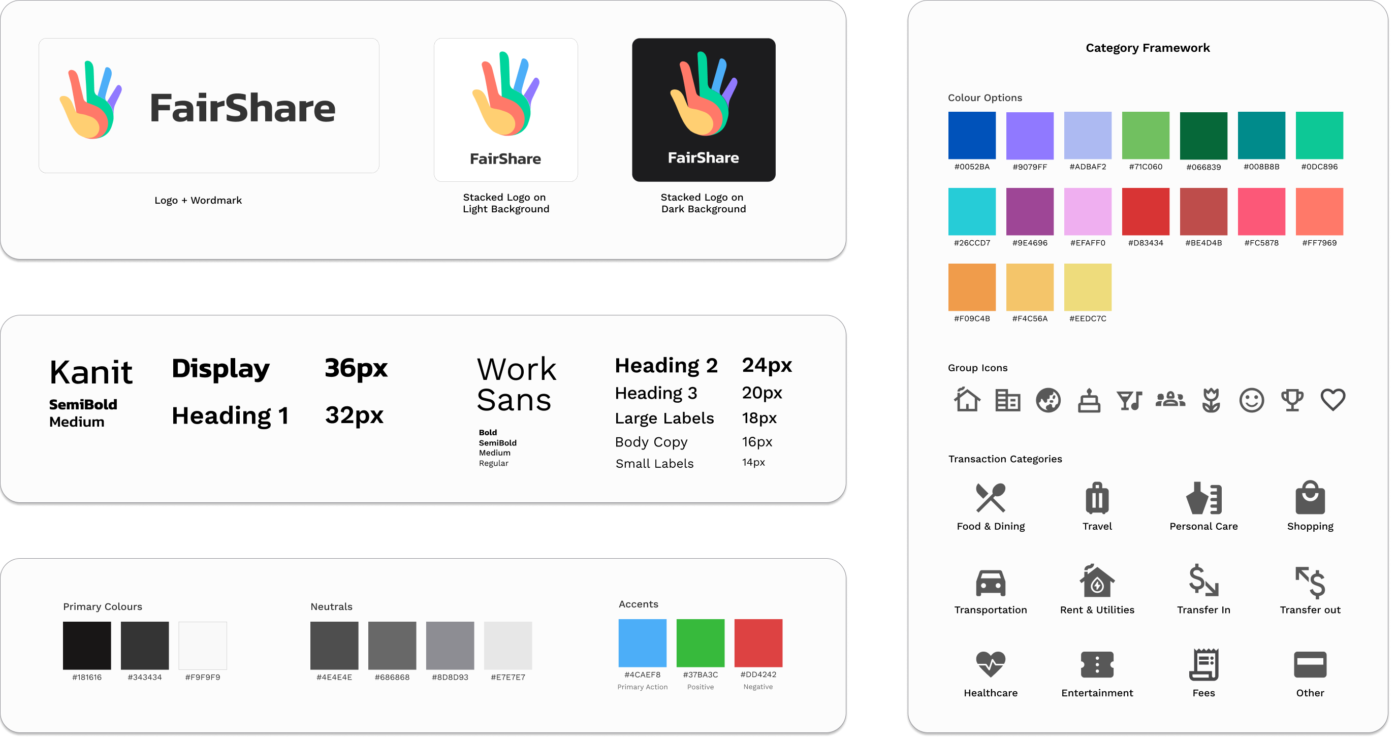
The visual system prioritizes clarity in a data-dense financial context. A restrained palette reduces noise, allowing amounts, balance states, and primary actions to stand out.
Color and iconography create a consistent category system across groups and transactions, supporting faster recognition and reducing reliance on text.
Together, the system reinforces clarity, consistency, and user trust.
A second round of testing with the same tasks measured whether the redesign had worked.
Real-world flows are rarely linear.
Our first iteration treated bill splitting as a single step. Testing revealed users kept backing up to check who had actually paid. The whole flow had to be restructured around that reality.
Scope is an active design decision.
Halfway through, we were designing personal budgeting features alongside group splitting. Keeping both meant neither worked well. Cutting personal finance features was the call that made the MVP actually usable.
Design intent needs to survive implementation.
When dev constraints emerged, some splitting logic was at risk of being simplified in ways that would have broken the uneven-split case we'd specifically designed for. Documenting edge cases and reasoning meant I could advocate for the right trade-offs instead of just accepting whatever was easiest to build.