Visual & Web Designer
·
April – August 2025

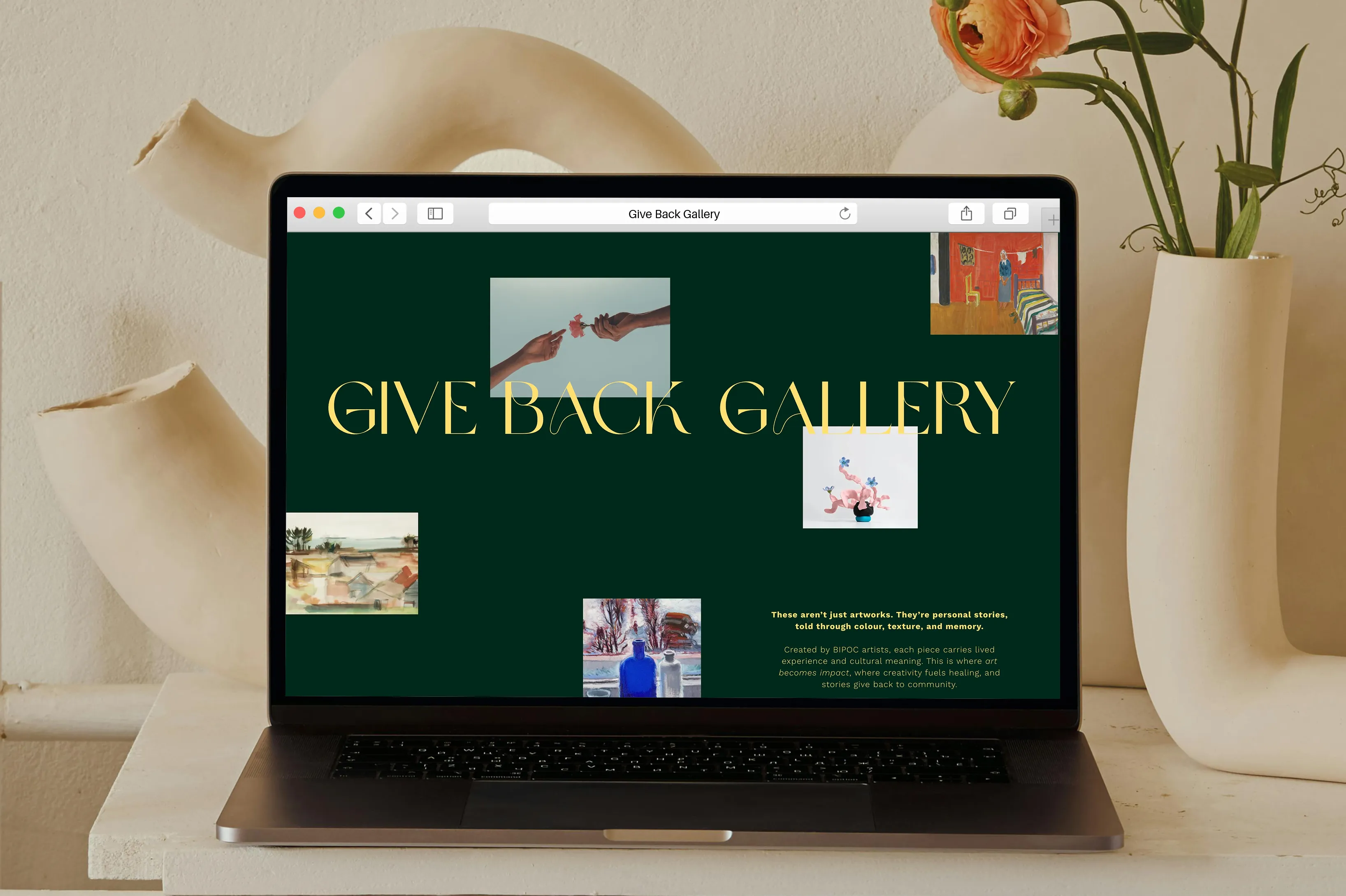
Give Back Gallery is an online gallery celebrating BIPOC and nonbinary artists, with proceeds funding essential community programs through the Support Network for Indigenous Women and Women of Colour (SNIWWOC).
Built from the ground up as a new initiative, GBG needed its own distinct visual identity: artistic and elevated enough to appeal to art buyers and donors, while staying warm and connected to SNIWWOC's community-rooted mission
Starting as a UI/UX and Content Designer intern, at SNIWWOC, the role expanded into a 4-month contract based on the work developed during the internship.
The focus was building the Give Back Gallery brand from discovery through to production, working alongside a fellow designer and under the SNIWWOC marketing team.
Before defining the Give Back Gallery (GBG) brand, the process started with understanding the landscape. Existing platforms either skewed too commercial and collector-focused, or too mass-market and generic.
Community-driven BIPOC and Indigenous organizations existed but weren't built around art sales. GBG needed to occupy a space none of these did: community-rooted, artist-centered, and elevated without being exclusive.
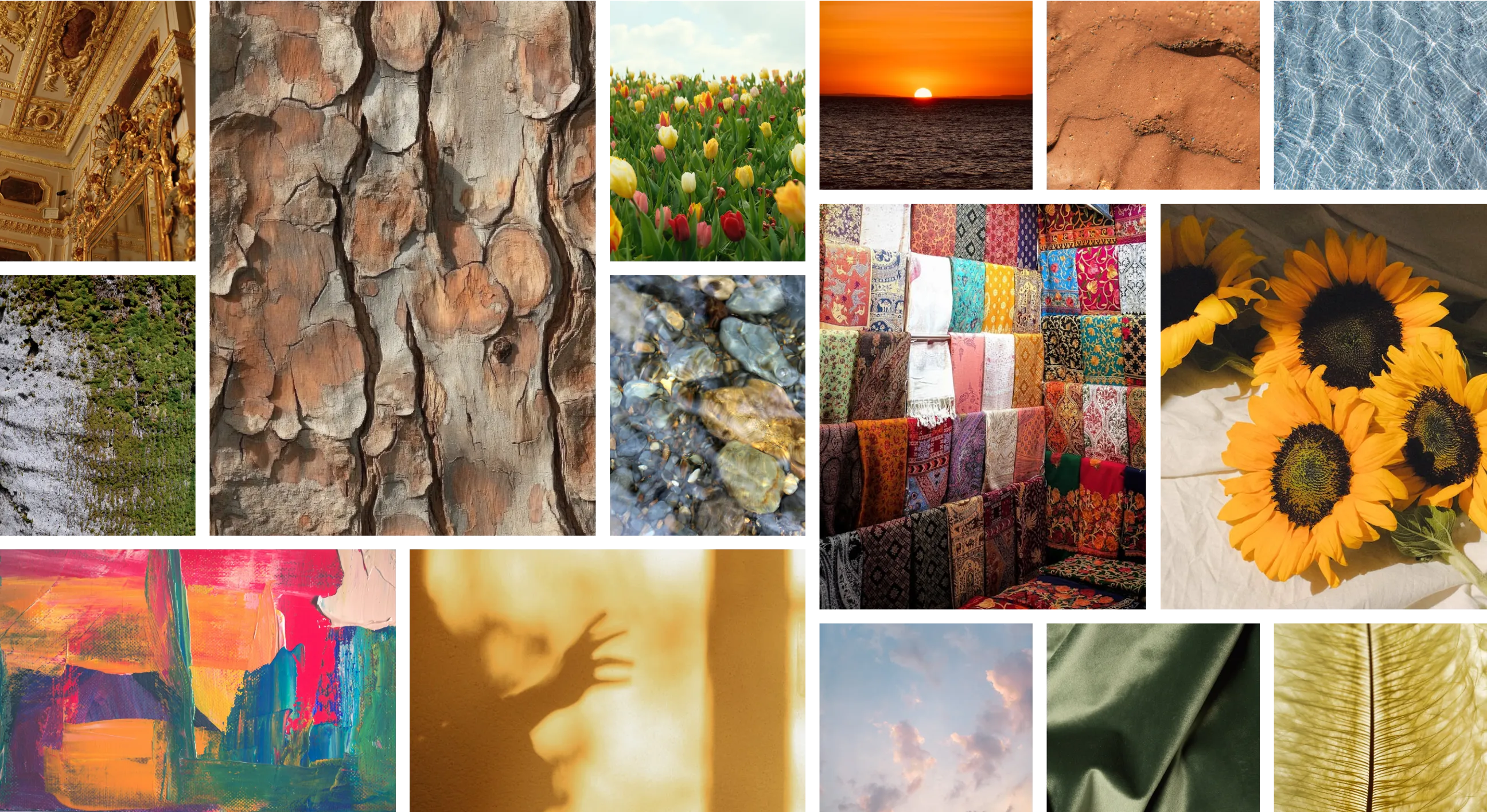
Moodboarding explored the visual world GBG could inhabit, drawing from two connected ideas: the textures and tones of land and natural materials, and the expressive colour of art-making itself. Bark, stone, sand, layered fabrics, sunflowers, and blazing warm light informed a direction that feels grounded and earthy while remaining vibrant and alive.
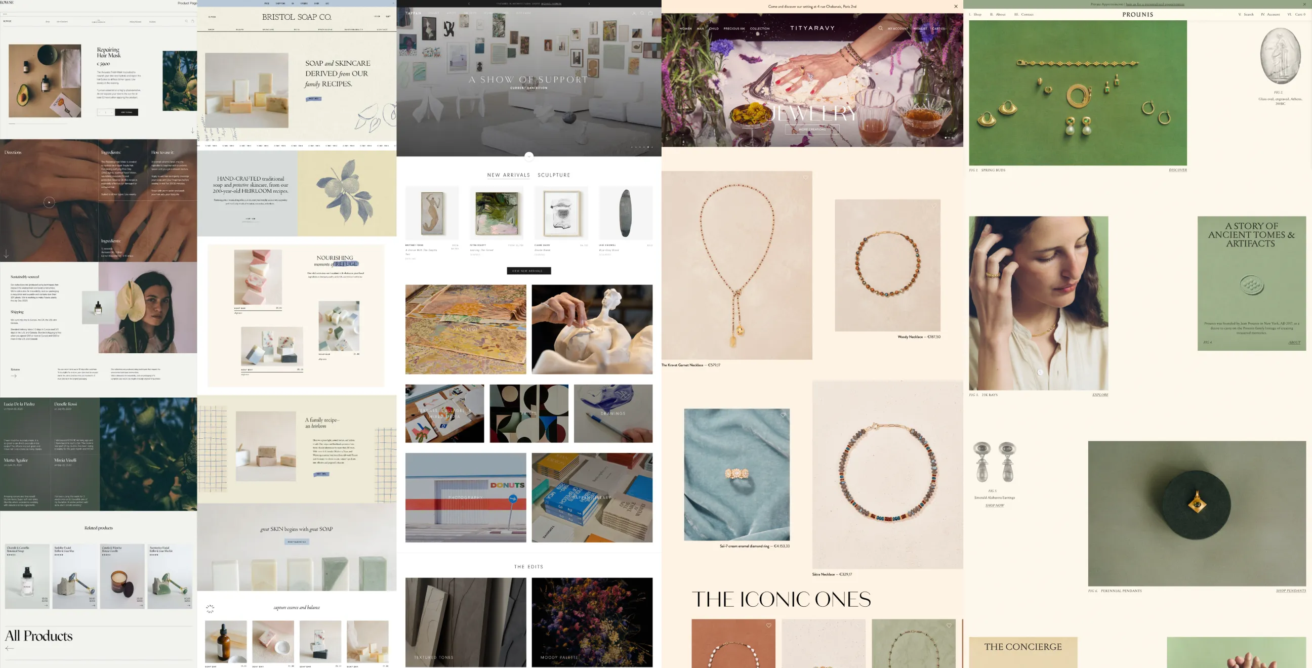
Website references explored elevated gallery layouts and expressive colourful storefronts, reflecting a brief that called for something playful but refined, with the feel of an art gallery.
Early iterations were developed collaboratively with another design intern. The final mark was further refined during the contract period, with ongoing feedback from the marketing team, org director, and an outside consultant throughout.
The brief asked for a logo that felt connected to SNIWWOC but distinct enough to stand on its own. During iterations, the direction shifted toward incorporating the full SNIWWOC mark, but embedding one complex logo inside another risked legibility and muddied the identity. The approach that worked took elements of the SNIWWOC mark instead: the circular framing, the central dot, the presence of a figure, rebuilt in a more expressive direction.
Arriving at the final mark involved several rounds of colour refinement. The marketing team wanted the marigold yellow background for its warmth and visual impact, with 'by SNIWWOC' included in the full lockup to make the relationship explicit. Rust brown for the wordmark carries a visual connection to SNIWWOC's brand, and a rust brown mark variation was developed for use on light backgrounds.
The logo system includes several variations to cover different use contexts:
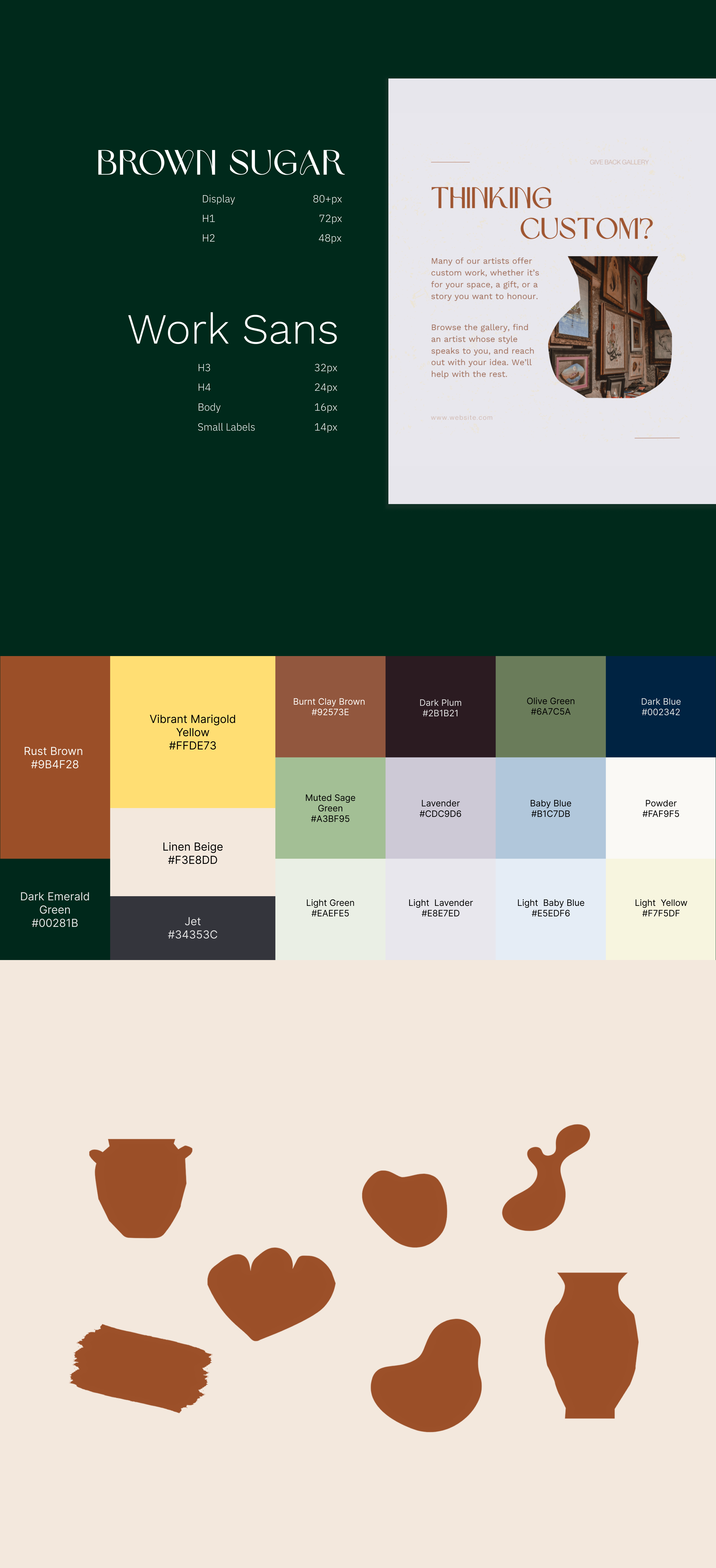
The palette was built to be vibrant and expressive, mirroring the range of artwork GBG would feature. It organises into three layers:
The light variants were built specifically to ensure contrast compliance across a palette this wide.
Brown Sugar handles all display and heading use. It's set at 5% letter spacing and typically outlined at 0.5 to 1px to improve legibility. The heavy embellishment and fine letterform details make it illegible below roughly 34px, and it works best for short phrases rather than extended text.
Work Sans handles everything else: subheadings, body copy, button labels, and small text. Readable and warm without being decorative, it provides a stable counterpart to Brown Sugar's expressiveness.
Graphic accents follow an organic, decorative direction: rounded shapes, botanical forms, vase silhouettes, and painterly textures. The idea was to echo the tactile, handmade quality of art-making and the natural textures from the moodboard. Something that feels warm and alive, not polished to the point of being cold.
These give the marketing team a visual language to pull from across touchpoints without the brand losing its feel.
The visual system had to hold up across a lot of different surfaces. Social templates, a website, physical merchandise. Each one has different constraints, and the goal throughout was to make the brand feel curated and considered in each context, not just consistent.
A set of Canva templates was built for the content the team would post most often: artist spotlights, custom order announcements, GBG mission content. Each one follows the same editorial structure but comes in colour variations so the feed doesn't feel like it's on repeat. The idea was to give the marketing team something they could actually use without having to redesign every time.
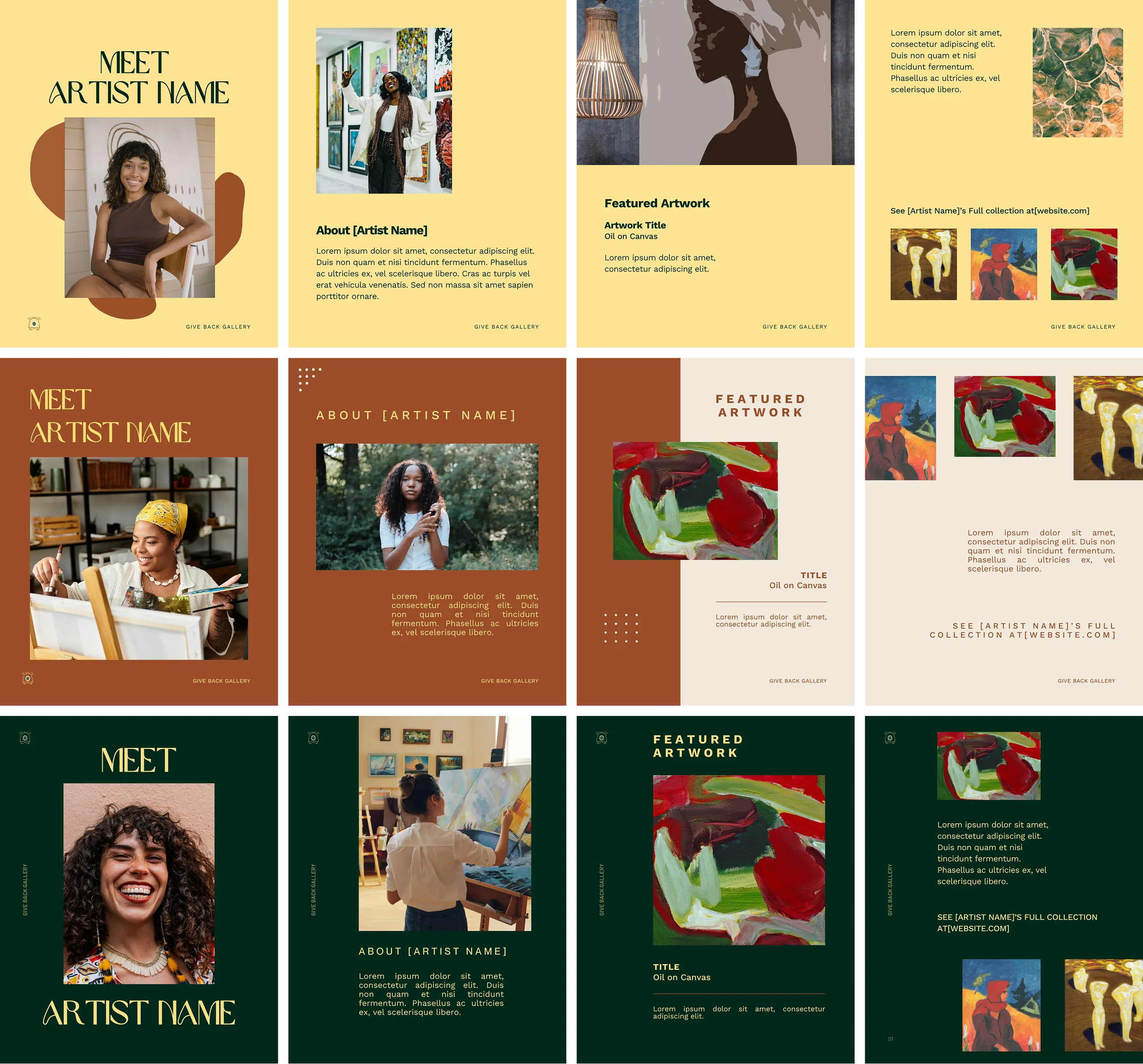
The brief called for something playful but refined, closer to an art gallery than a standard e-commerce site. Artworks display at their natural proportions so the shop feels like browsing a gallery wall rather than a product grid. Dynamic filtering lets people sort by artist, medium, and theme. The theme-based filter was a deliberate choice, connecting pieces across the collection through shared ideas and supporting the storytelling aspect of GBG's mission.
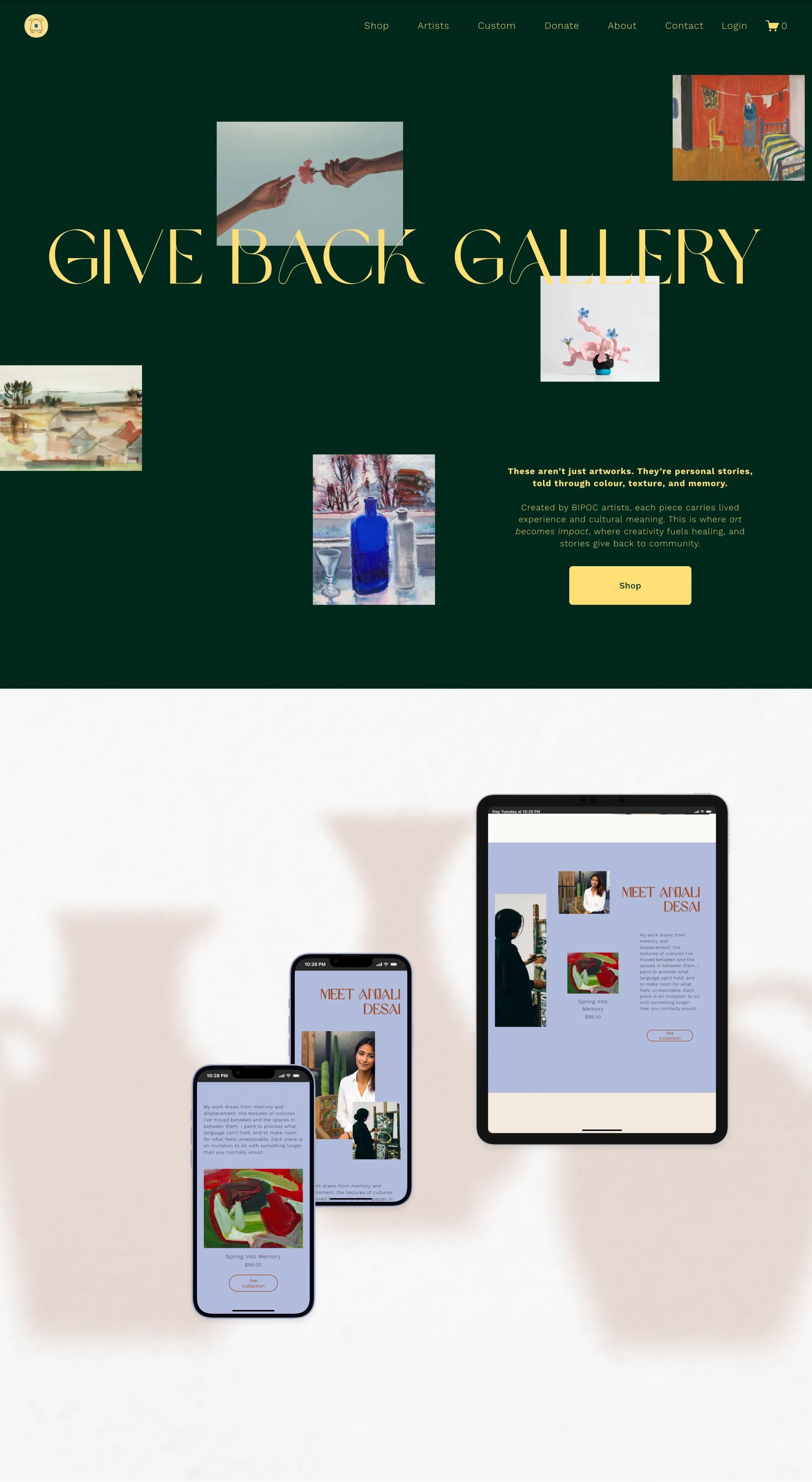
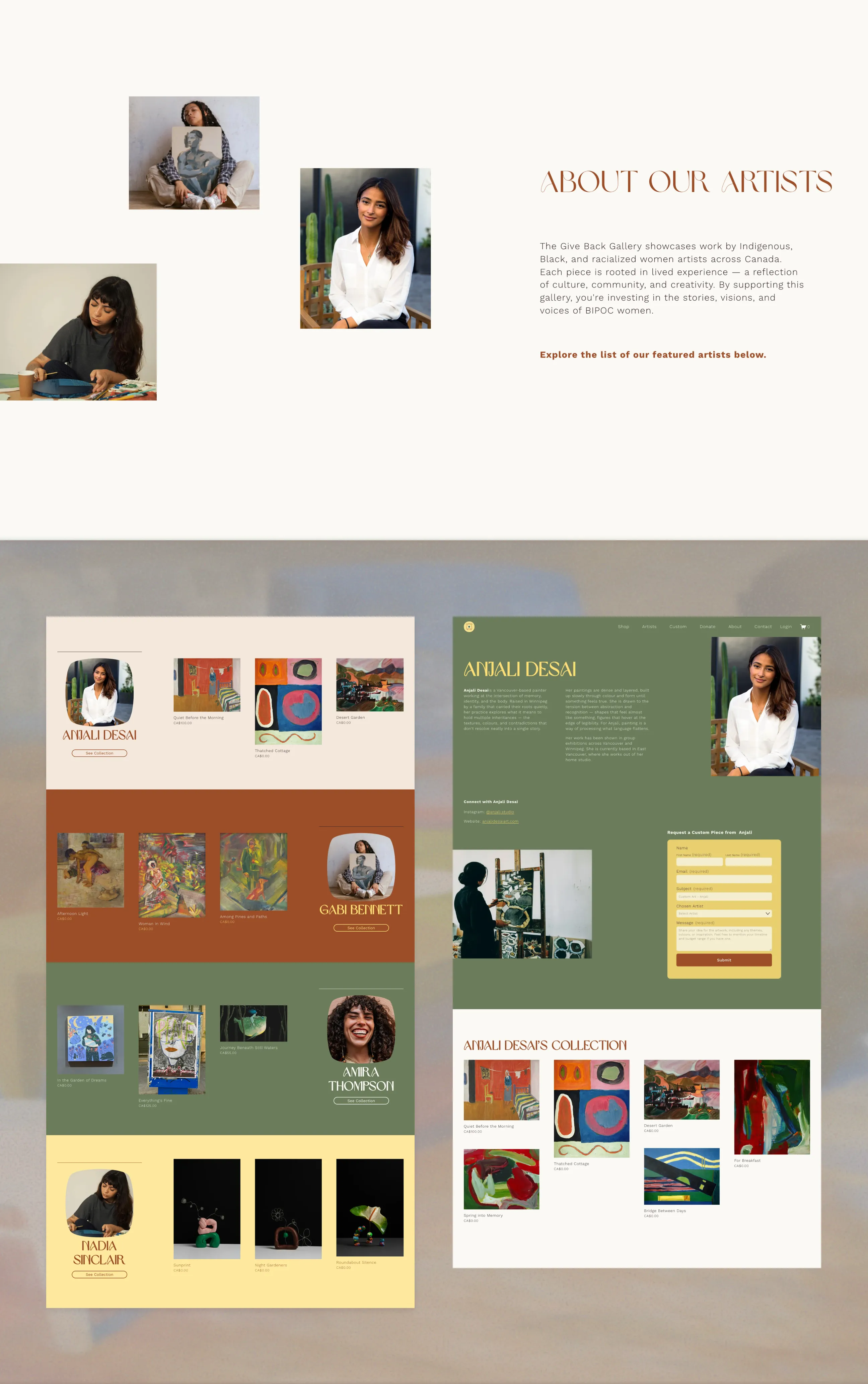
The longer-term vision is to feature GBG artists' artwork on products, making BIPOC art visible beyond the screen. Since the artist roster wasn't finalized, the pieces shown here focus on GBG's own brand identity.
Two shirt designs and a tote bag were developed through Gelato, each bringing the visual system into a physical context. The branding is kept intentionally subtle, using tone-on-tone treatments for the logo and text so the pieces feel elevated rather than promotional.

The Give Back Gallery brand is complete and ready for launch. The website is fully built on Squarespace, with all sections in place pending the finalization of the first artist lineup. Canva templates have been handed off to the SNIWWOC marketing team for ongoing use, and merchandise is production-ready through Gelato. The full visual system is documented and ready to scale as the roster grows.
Working within an existing brand is its own kind of brief.
GBG couldn't exist in isolation from SNIWWOC. Navigating that relationship pushed the identity into more considered territory than a blank-slate project would have.
Restraint makes a wide system work.
The marketing team wanted more options across type and colour. Limiting each element to a specific role kept the brand cohesive even with an expanded palette.
More context makes better design decisions.
The internship was mostly execution. The contract brought involvement in research and strategy earlier, which gave the visual decisions more grounding.
Two designers on one brief changes how you make decisions.
It's less about who has the better idea and more about building enough shared language to evaluate both. That took longer than expected but produced a more considered result.