Graphic Designer
·
November 2024

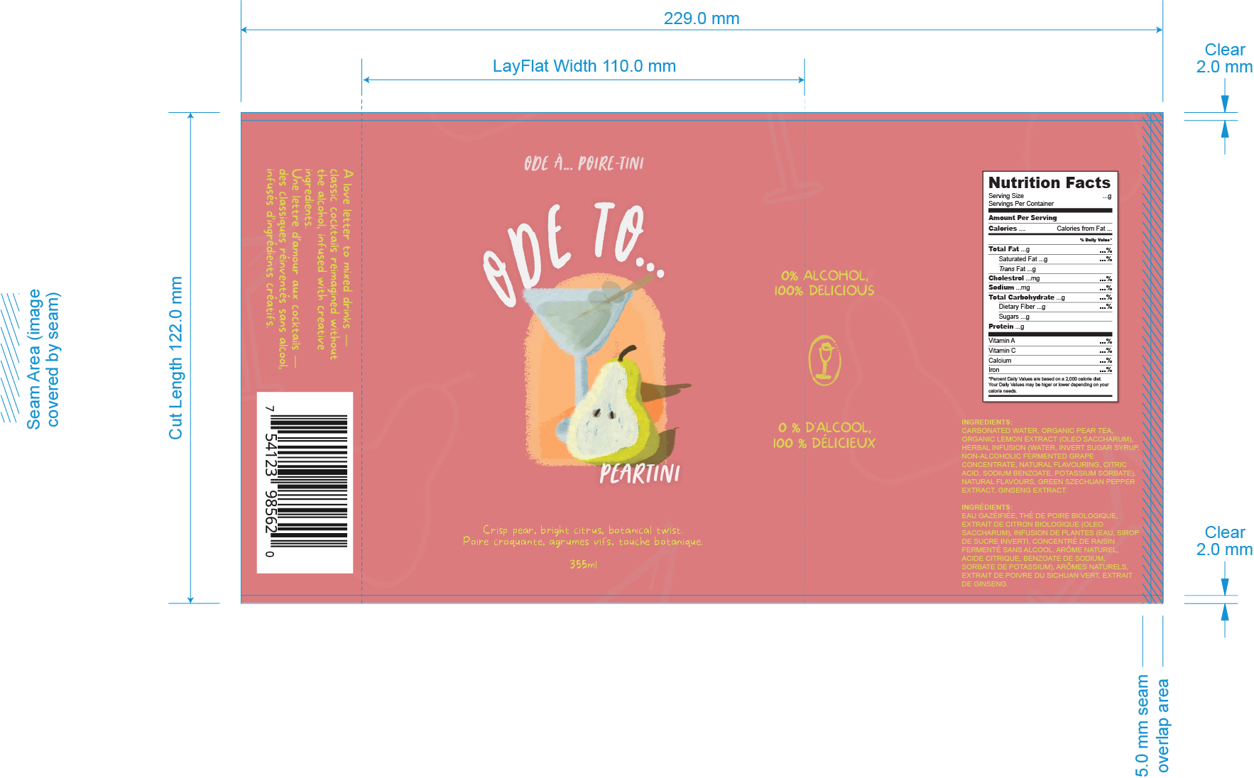
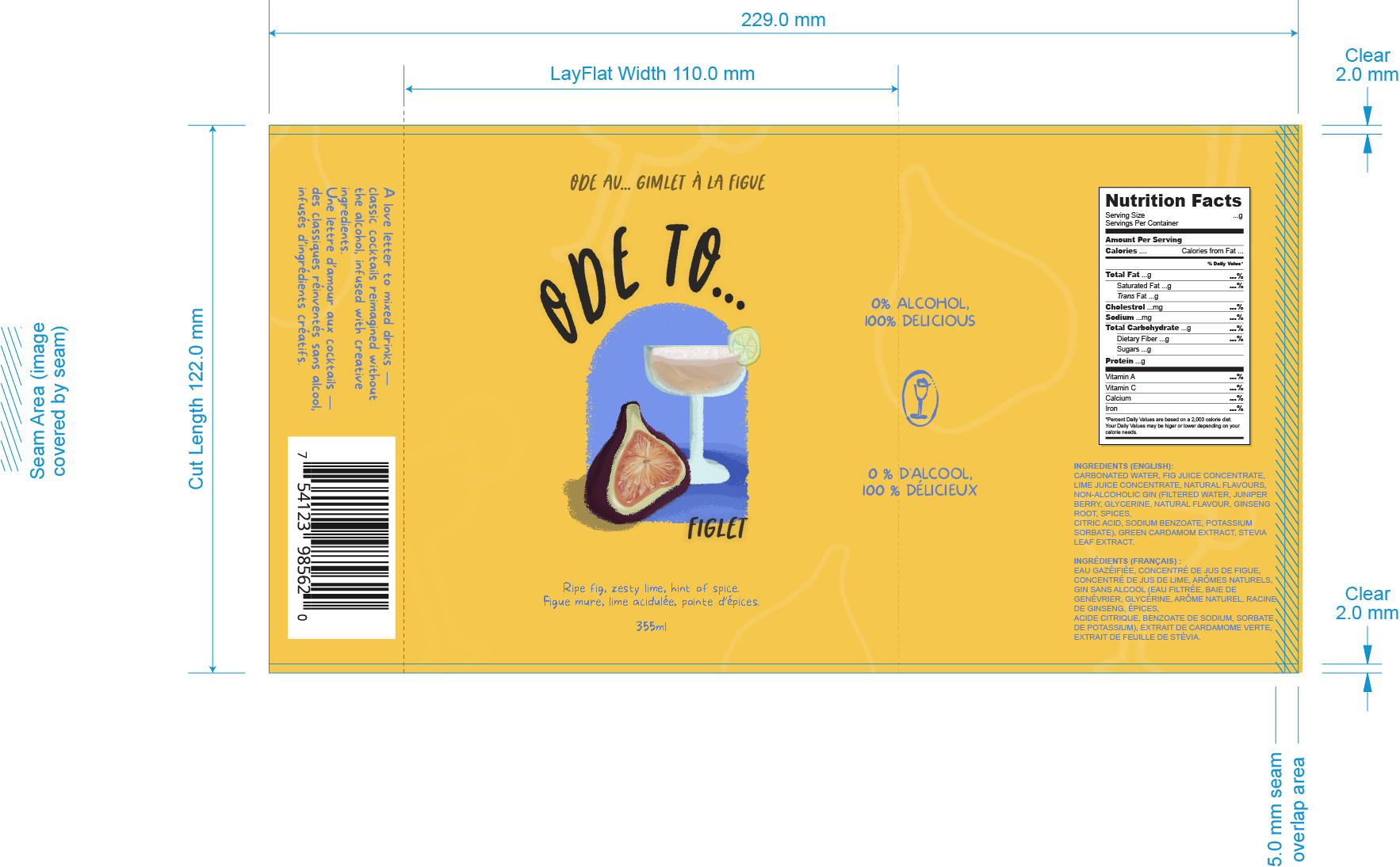
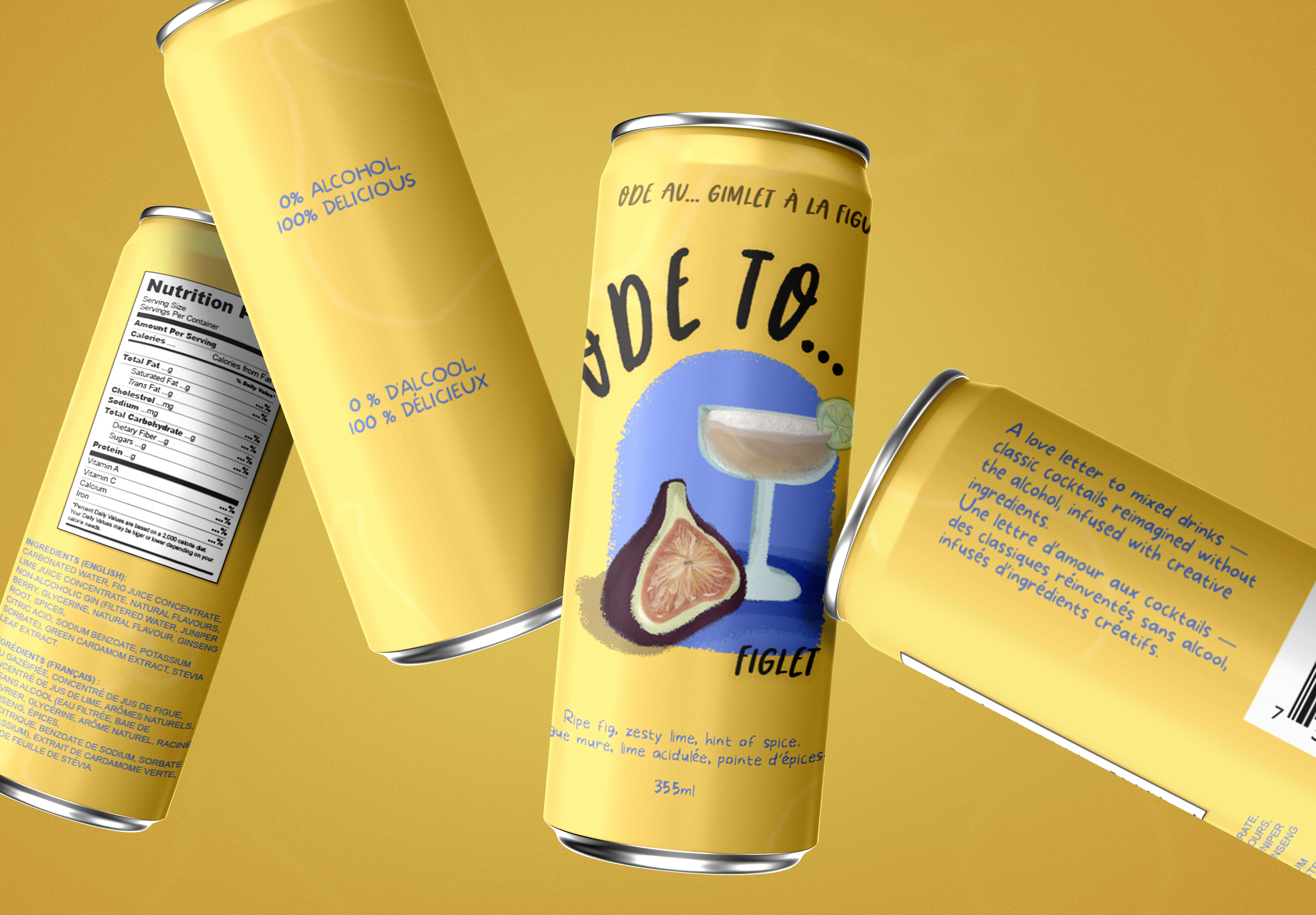
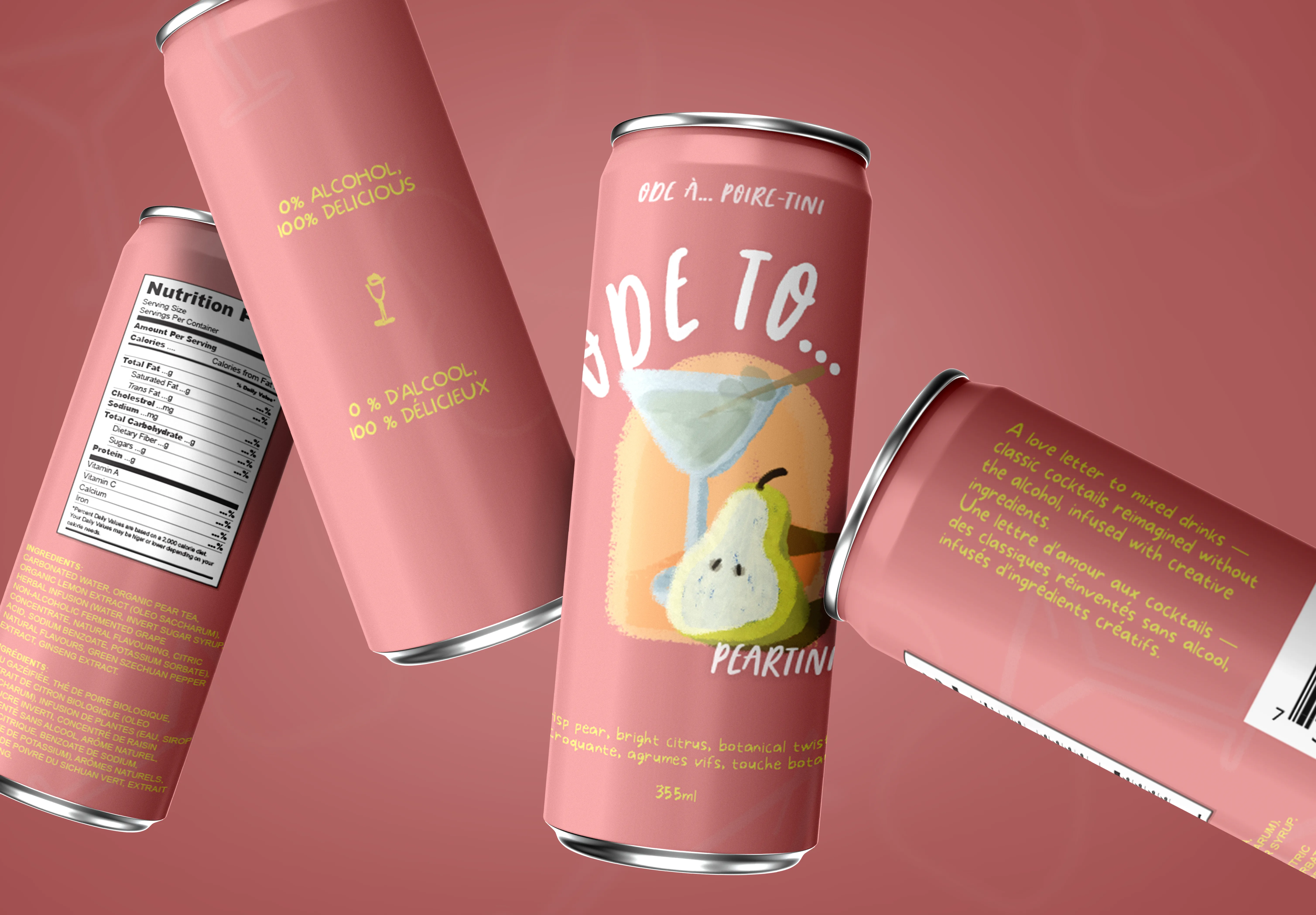
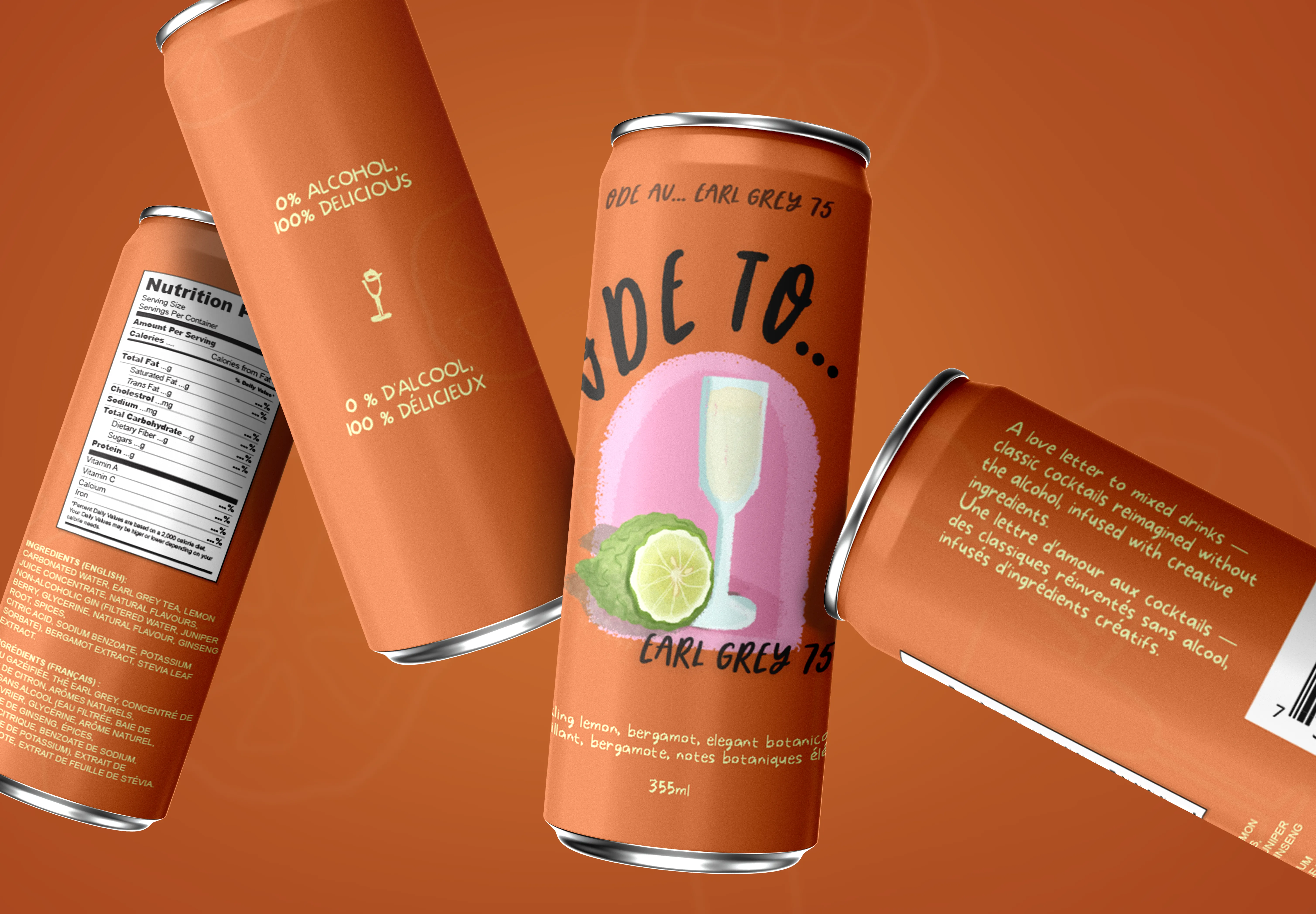
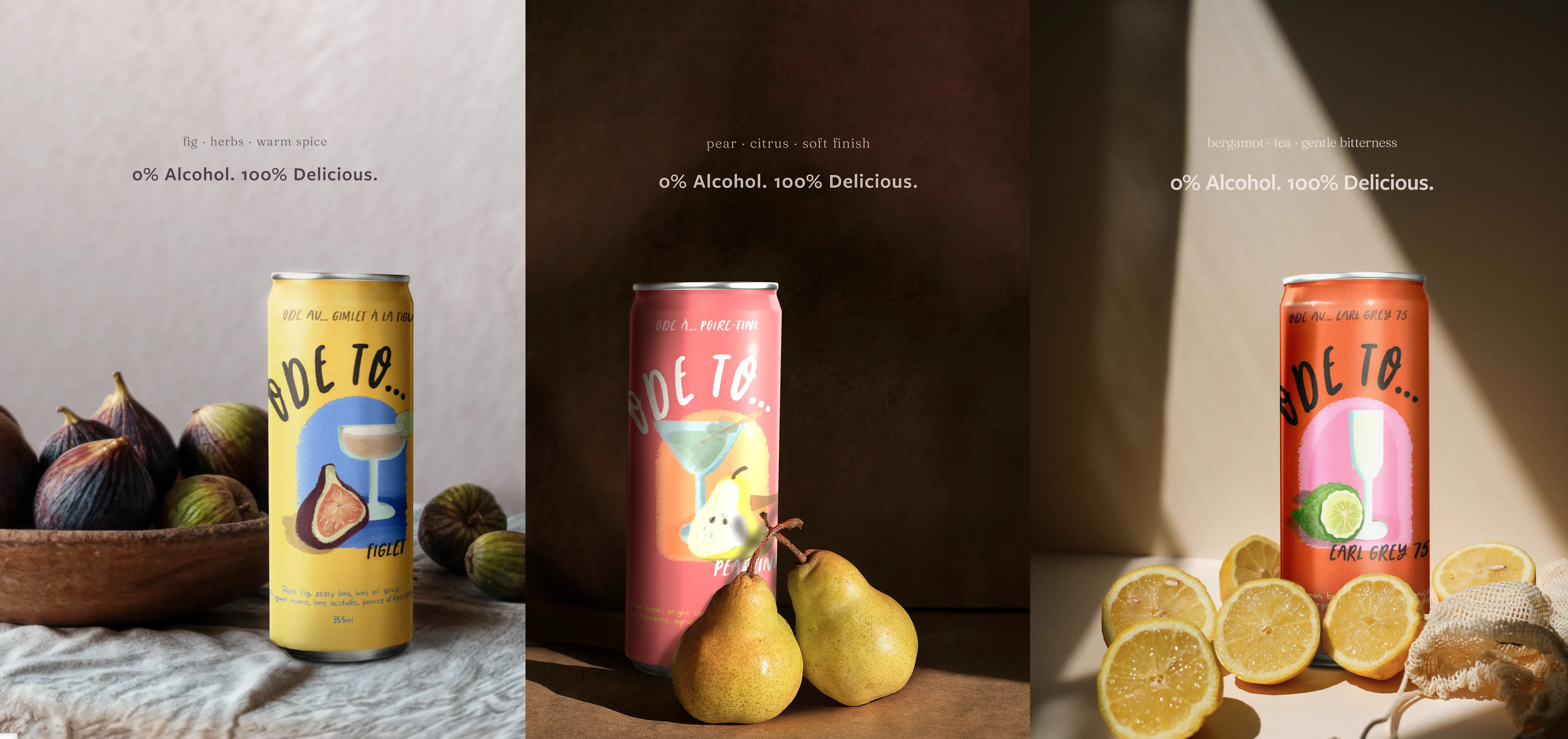
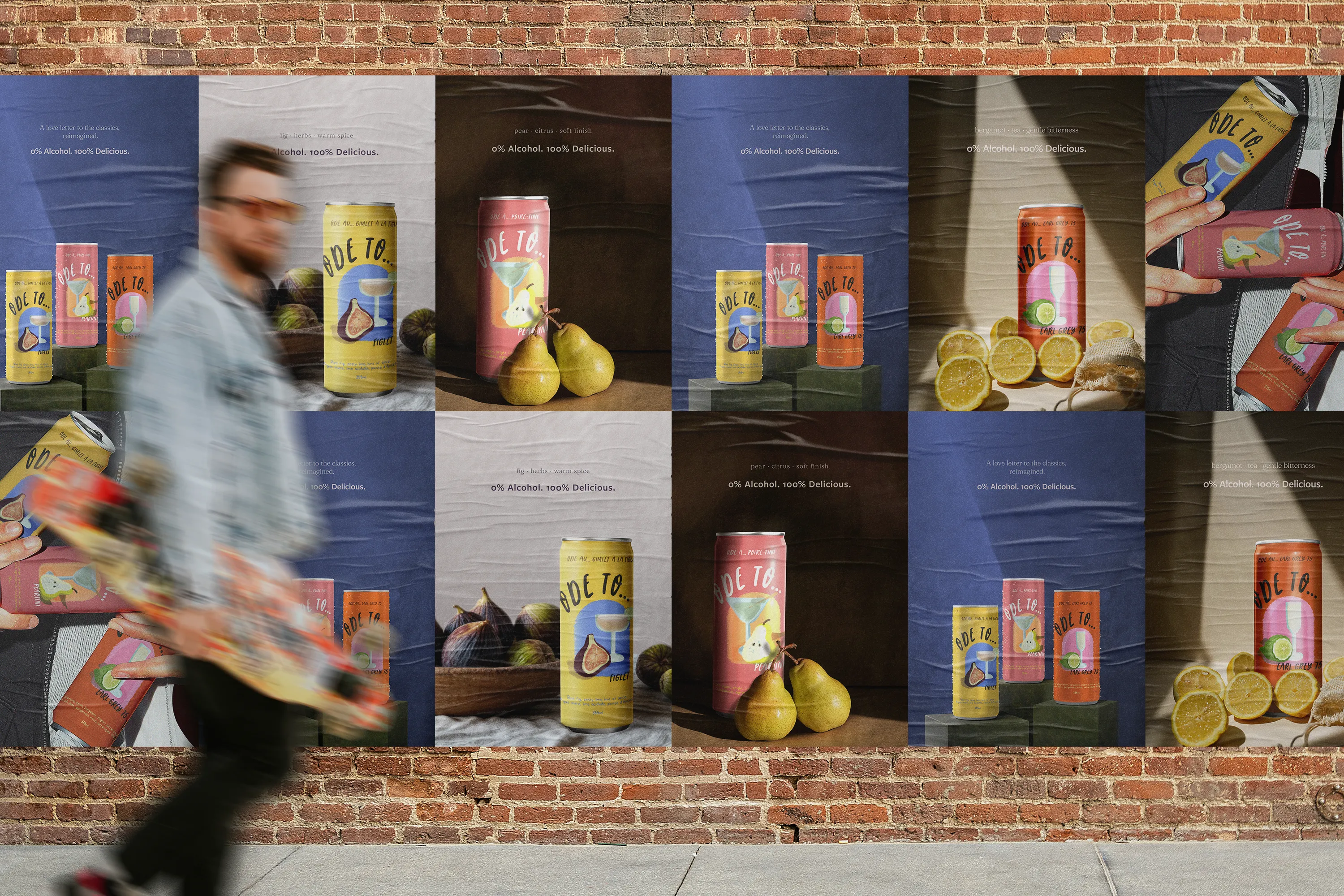
Ode To... reimagines classic cocktails, spirit-free. The label system uses painterly textures and natural colour to feel made-by-hand yet shelf-ready. A stable grid and type scale anchor the brand; palette logic and ingredient cues differentiate each flavour.
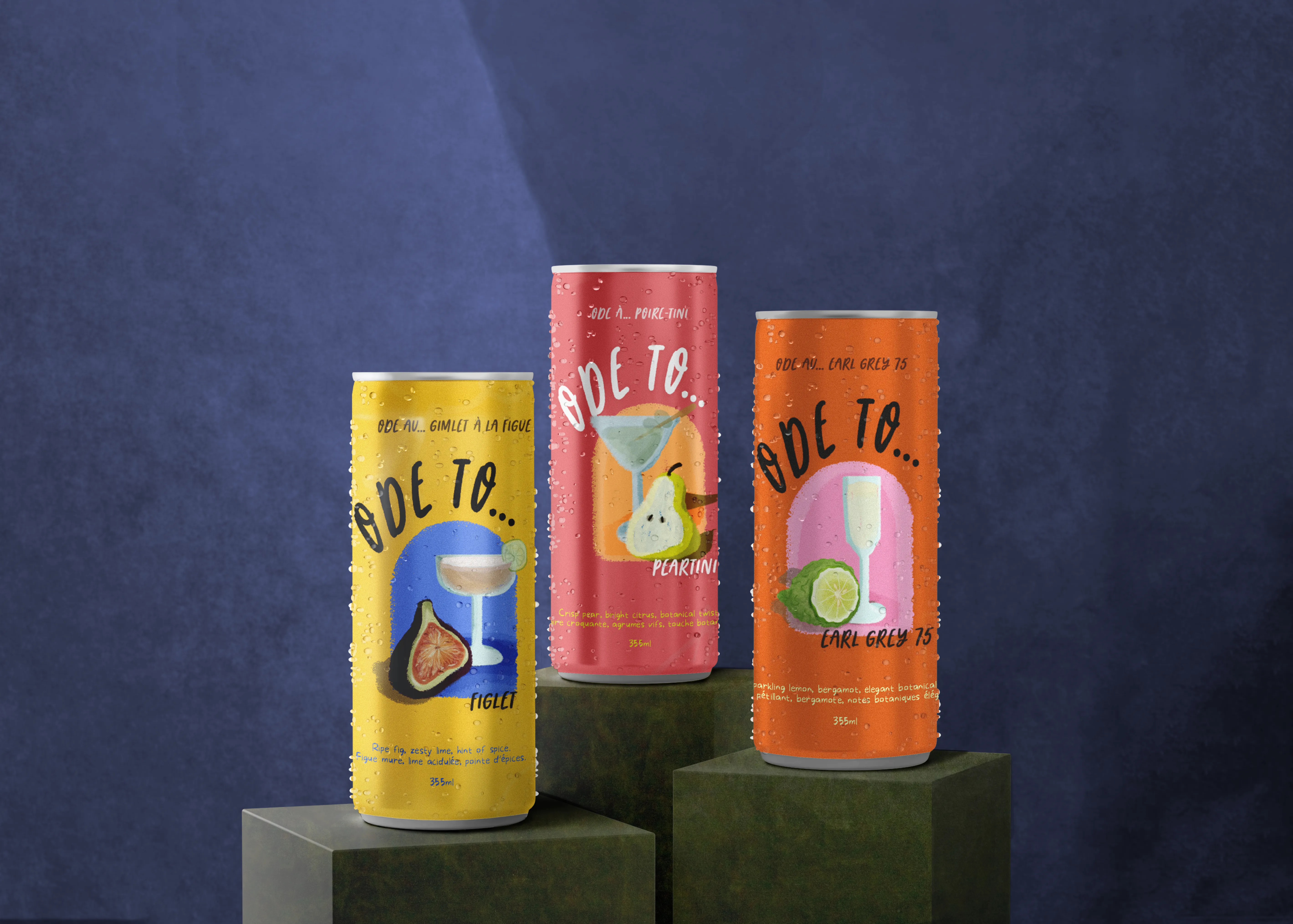
Illustration execution:
Ingredient illustrations were designed to a consistent scale and framing so they could be placed reliably across label variants without disrupting layout or hierarchy.
Design within constraints:
Artwork and typography were composed directly within the dieline, accounting for wrap, seam overlap, and safe areas. This ensured key elements remained visible and balanced once applied to the bottle.
Final deliverables:
Each flavour was delivered as a complete, print-ready dieline with all required measurements and layout considerations in place.